The Silence of the Lambs: A Study in Claustrophobic Geometry
Revisiting Jonathan Demme’s 1991 thriller after twenty years, I was struck by how little it cares about standard horror tropes. Most films in this genre try to scare you with what lurks in the shadows but this film terrifies you with what is right in front of your face. When I analyze the visual structure, I see a deliberate attempt to make the viewer feel physically small and exposed. It is not the violence that haunts me but the uncomfortable intimacy of the camera work.
The Subjective Camera and The Male Gaze
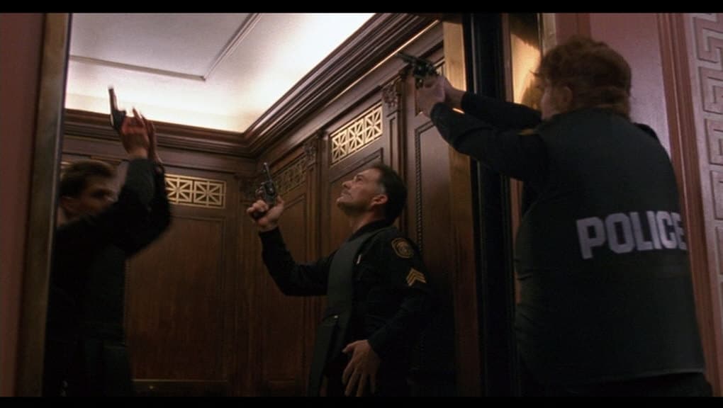
When I broke down the "Quid Pro Quo" sequences, I noticed that Demme consistently places the lens directly in the eyeline of the actors. When Hannibal Lecter speaks, he looks right at me. This use of subjective camera forces us to inhabit Clarice Starling’s headspace completely. I found it fascinating how the supporting characters—who are almost exclusively male—stare directly into the lens with a shallow depth of field while Clarice usually looks slightly off-center. This technical choice creates an immediate and visceral power imbalance where the audience feels the weight of the male gaze just as heavily as the protagonist does.
Chiaroscuro and The Architecture of Containment
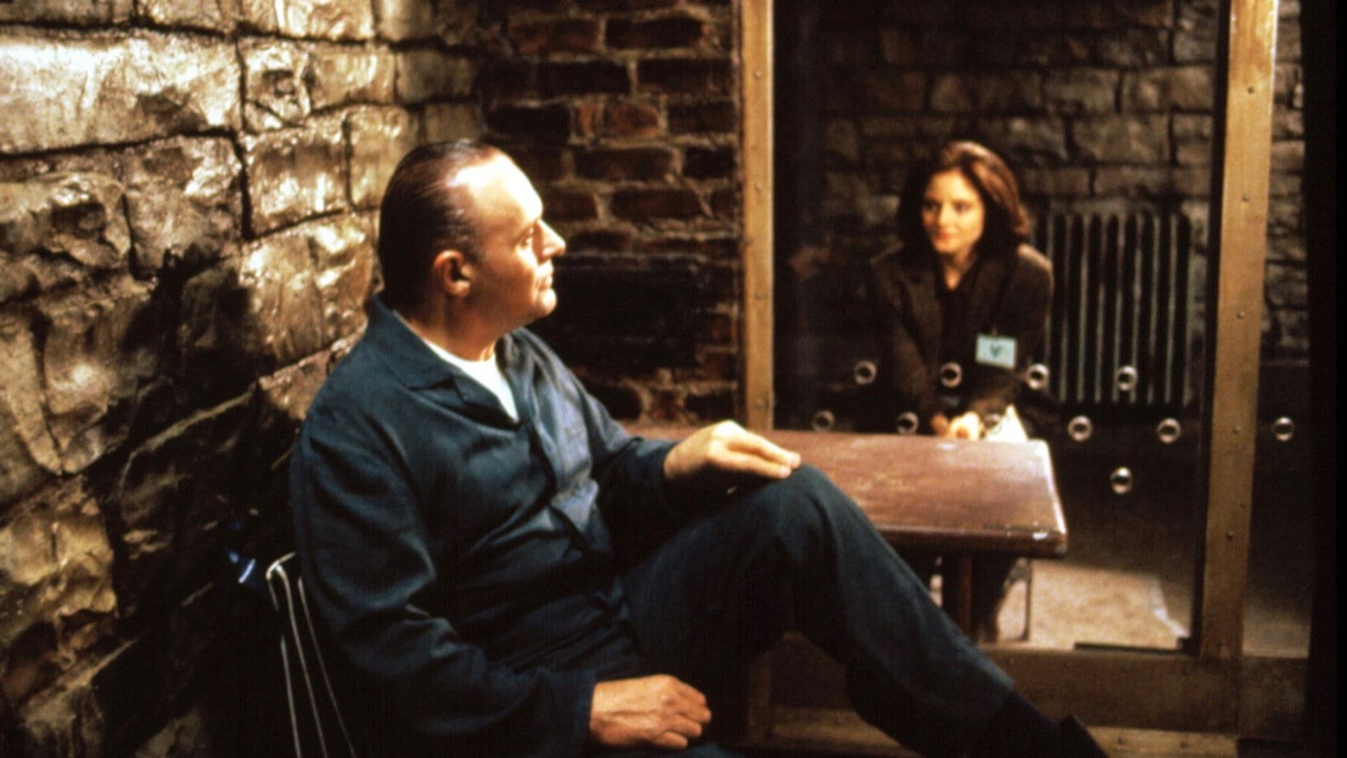
The lighting choices fascinated me during this re-watch because they tell a story of two different prisons. In the FBI academy scenes, the image is bathed in sterile and cool blues with harsh fluorescent lighting that exposes every flaw. Contrast this with the dungeon scenes where Lecter is held. I noticed a subtle use of Chiaroscuro lighting that leaves his eyes in deep shadow until he chooses to lean forward. The decision to use a glass wall instead of bars creates a terrifying transparency. The lighting reflects off the glass and superimposes Clarice’s reflection over Hannibal’s face which visually merges their identities in a way that dialogue alone could never achieve.
Visual Tension in Editing
I have to mention the cross-cutting in the final act because it is a textbook example of spatial manipulation. The editor creates a false sense of geography that tricks the audience into believing the FBI raid and Clarice’s location are happening simultaneously in the same space. When I looked closely at the basement sequence, the switch to the killer's point of view through night-vision goggles changes the film's texture entirely. The high-grain and green-tinted visuals strip Clarice of her agency and force us to view her not as a hero but as prey.
The Flickle Visual Score
9.8/10 – This score reflects the revolutionary use of center-framed extreme close-ups with a specific focal length that destroys the fourth wall and forces the audience into an uncomfortable psychological intimacy with the antagonist.
If you think you have the eye to spot these specific camera techniques, test your skills in our daily movie puzzle game at https://www.flickle.co
Mastered the Frame?
Test your visual memory and see if you can guess this movie in 6 frames.
Solve Today's Puzzle