American Psycho: The Curated Void
I admit that when I first reviewed this film upon release I mistook it for a stylized slasher but revisiting it two decades later reveals a misunderstood satire about the horror of conformity. American Psycho is not about a serial killer. I found that it is a comedy of manners where the ultimate punchline is that no one is actually listening to you. My analysis suggests that director Mary Harron weaponized the cinematic language of 1980s advertising to sell us a nightmare disguised as an aspirational lifestyle.

The Architecture of Emptiness
The production design is disturbingly pristine and rejects any hint of organic life. I noticed that Patrick Bateman’s apartment resembles a sterile gallery space rather than a home which visually reinforces his internal void. The cinematography by Andrzej Sekula frequently utilizes reflective surfaces like mirrors and polished chrome and high rise windows. This visual aesthetics choice constantly doubles Patrick’s image and suggests that his identity is nothing more than a series of projected reflections. He is incapable of seeing himself and can only gaze at the surface level presentation he has meticulously constructed.

The Sonic Weaponization of Pop
A critical review of the sound design reveals that the musical "needle drops" are used as instruments of torture rather than nostalgia. I observed that Patrick Bateman does not enjoy music emotionally but analyzes it like a technical manual to appear human. The juxtaposition of the upbeat synthesized pop of "Hip to Be Square" with the brutal axe murder of Paul Allen creates a cognitive dissonance in the audience. I found that these scenes suggest that pop culture itself is a numbing agent that allows consumers to ignore the horrors implicit in their materialistic society.

Violence in Typography
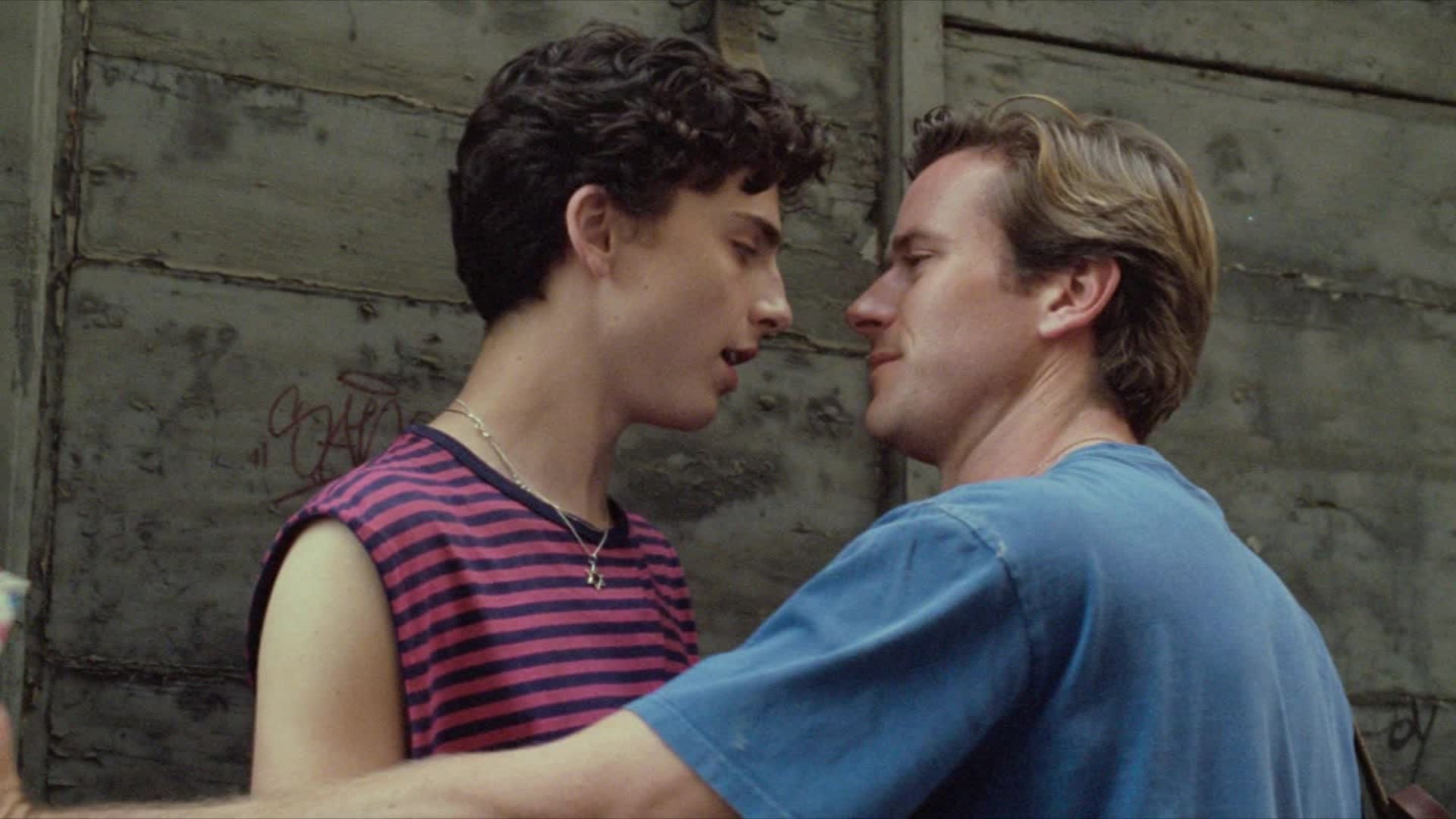
I was struck by how the film treats social interactions with the same visual intensity as physical violence. I analyzed the infamous business card exchange scene and realized it is shot and edited like a high stakes western duel. The camera work utilizes extreme close ups with a shallow depth of field to fetichize the texture of the cardstock and the subtle off white coloring. The lighting highlights the embossed lettering as if it were a weapon. This visual storytelling teaches us that in Patrick’s world a slightly better typeface is a more devastating blow than a chainsaw.
The Flickle Visual Score
9.8/10 I am awarding this near perfect score for the clinical precision of the cinematography that captured the soulless beauty of the era and for the brilliant use of pop music as counterpoint to the violence.
If you think you have the eye to distinguish between "Bone" and "Pale Nimbus" coloring then test your skills in our daily movie puzzle game at https://www.flickle.co

Mastered the Frame?
Test your visual memory and see if you can guess this movie in 6 frames.
Solve Today's Puzzle