Arrival: The Linguistics of Light and Grief
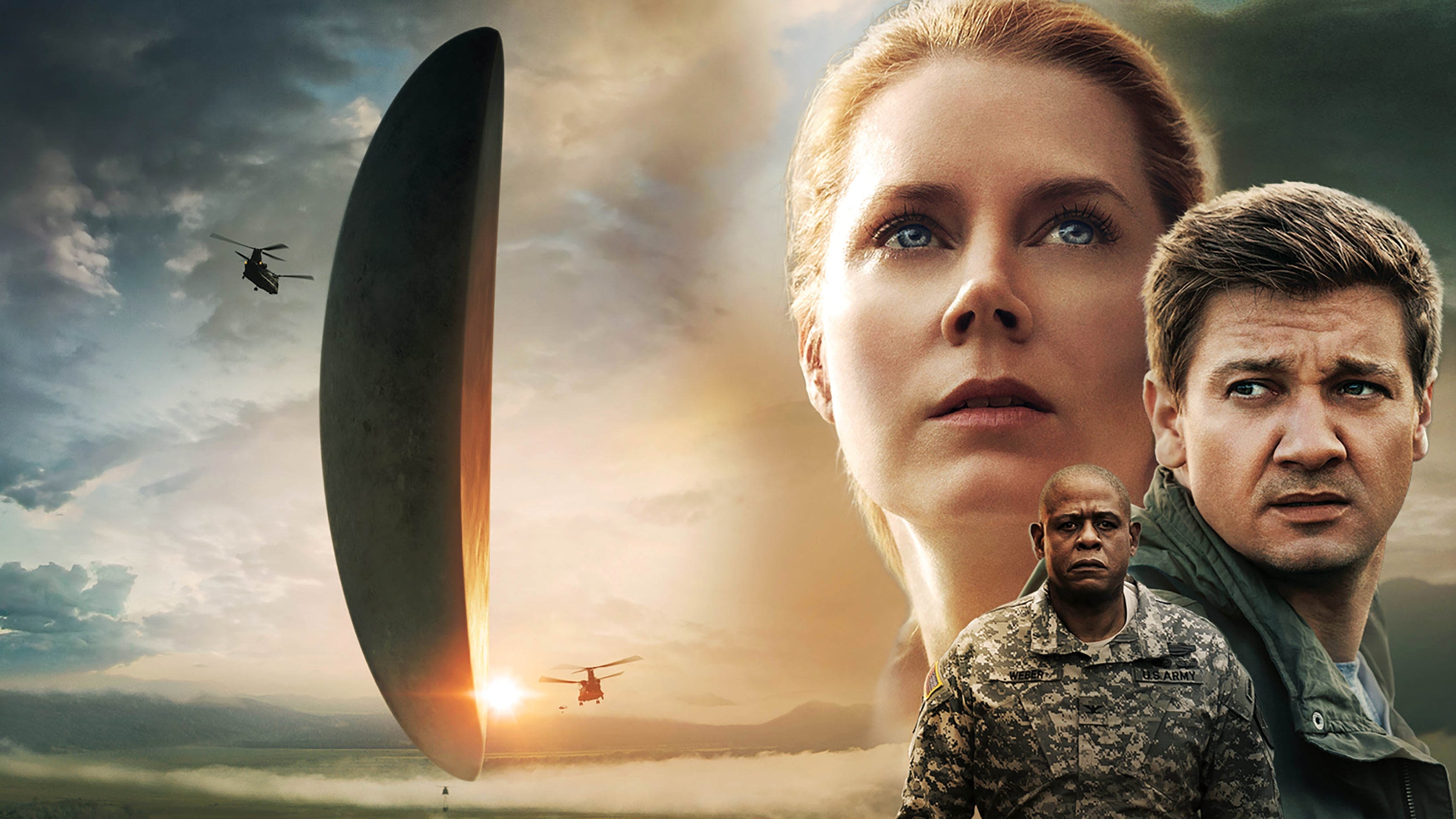
I admit that when I first heard the premise of Arrival I expected another invasion movie but I was profoundly wrong. I found that director Denis Villeneuve uses the genre not to explore space but to explore the internal architecture of grief. My analysis suggests that the film is a quiet revolution in sci fi where the most powerful weapon is not a laser but a whiteboard. It challenges the viewer to look at time not as a line but as a circle.
Shallow Focus and The Intimacy of Contact
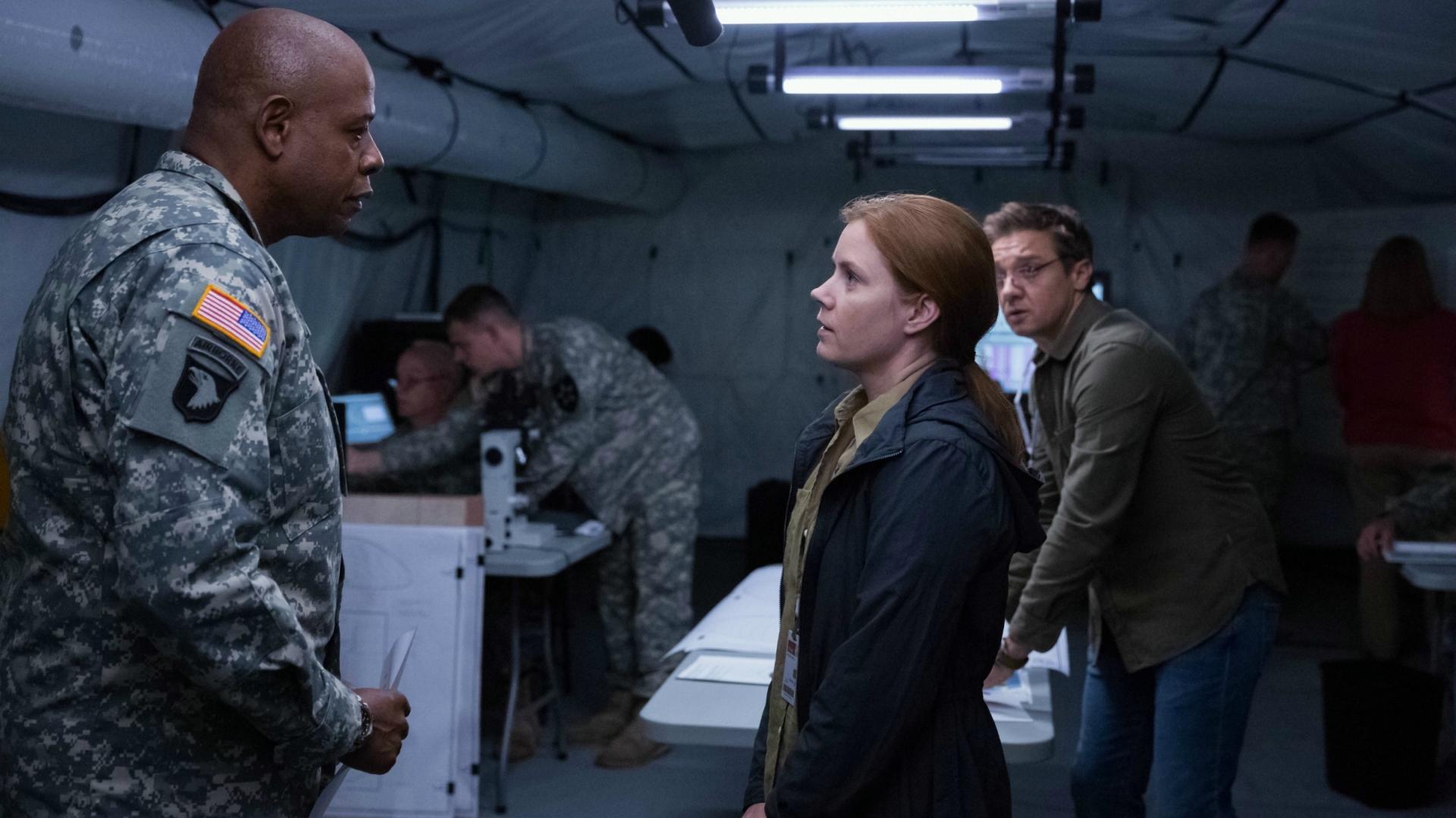
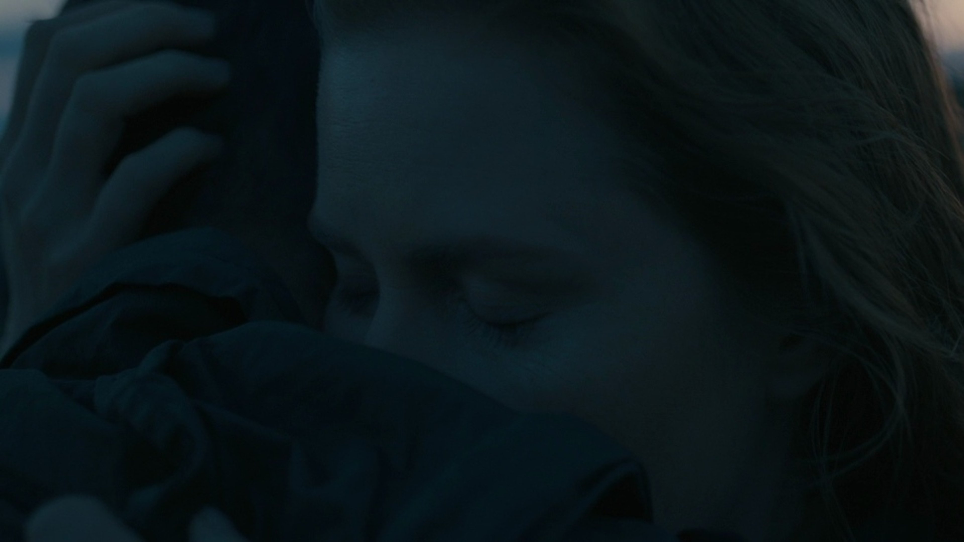
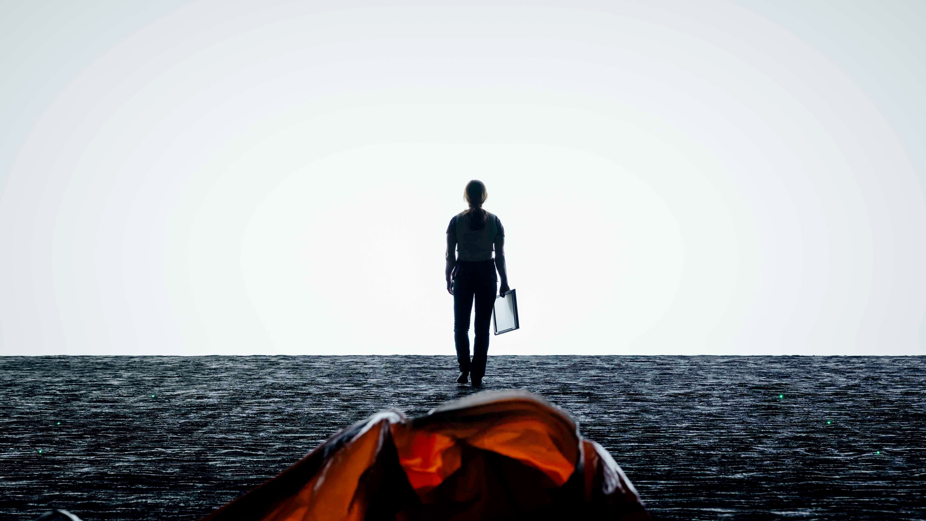
The cinematography by Bradford Young is aggressively dark and relies heavily on available light. I noticed that he uses an incredibly shallow depth of field which keeps the background constantly blurry. This visual aesthetics choice forces the viewer to focus intensely on the faces of Amy Adams and Jeremy Renner. It creates a sense of claustrophobia that I found essential because it grounds this global event in a deeply personal emotional reality. We are not watching the world react but we are watching one woman process the impossible. The darkness inside the ship feels tactile and heavy which makes the eventual reveal of the aliens feel earned rather than sensational.
The Texture of Language and Ink
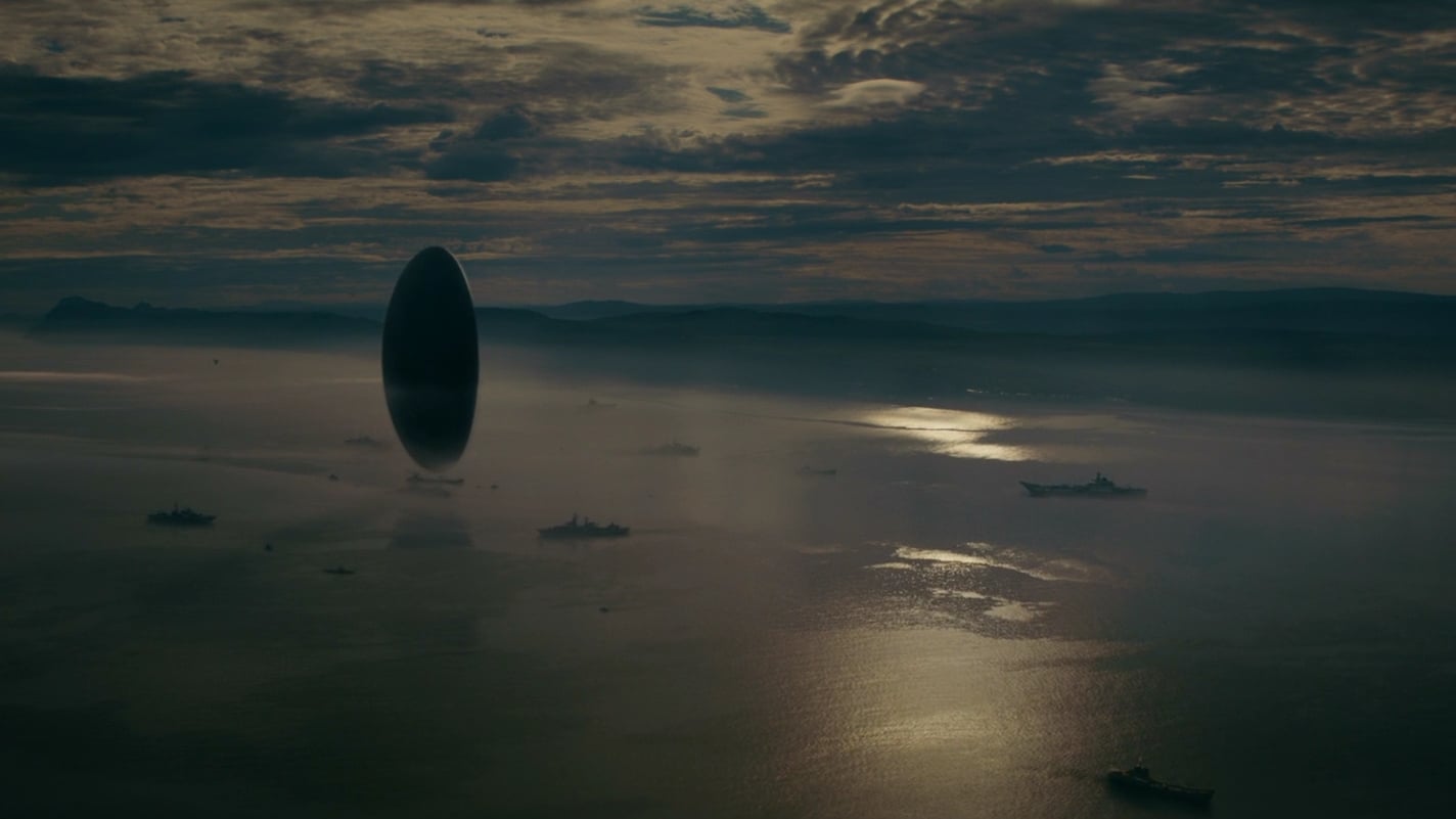
I was struck by the organic nature of the production design regarding the aliens. Most sci fi creatures look like computer generated monsters but the Heptapods look like ancient elephants or whales hidden in the mist. I observed that their written language looks like coffee stains or ink suspended in water. This symbolism is brilliant because it visualizes the concept of non linear time. The circular logograms have no beginning and no end which visually teaches the audience the mechanics of the plot analysis before the script even explains it. The design itself is a primer on how to watch the film.
Color Grading as a Narrative Trick
A critical review of the editing reveals how the film cheats time through color. I noticed that the scenes inside the alien shell are cold and desaturated while the visions of the daughter are bathed in a warm and hazy sunlight. This chromatic contrast initially leads us to believe the warm scenes are memories from the past. I realized later that this was a deliberate visual misdirection. The visual storytelling uses the warmth of those scenes to represent the hope of the future rather than the nostalgia of the past which makes the final revelation devastatingly effective. It plays on our cinematic conditioning to surprise us with the truth.
The Flickle Visual Score
9.5/10 – I am awarding this score for the daring choice to shoot a blockbuster sci fi film with the lighting constraints of an indie drama which created a texture of reality that grounds the high concept narrative.
If you think you have the eye to decipher the logograms before the military does then test your skills in our daily movie puzzle game at https://www.flickle.co

Mastered the Frame?
Test your visual memory and see if you can guess this movie in 6 frames.
Solve Today's Puzzle