Fight Club: The Chemical Burn of Cinema
I remember walking out of the cinema in 1999 feeling like I had just been punched in the gut. While many audiences mistook Fight Club for a glorification of violence I found that it was actually a scathing satire on fragile masculinity. My analysis suggests that David Fincher used the medium of film itself to abuse the viewer. He deliberately breaks the fourth wall and inserts glitches to remind us that we are watching a product even as the script attacks consumerism.

Subliminal Splicing and The Cigarette Burn
The most aggressive element of the editing is the use of single frame inserts. I noticed that long before Tyler Durden appears as a character the editor splices single frames of him into the mundane life of the Narrator. This visual storytelling technique forces the audience to question their own sanity just like the protagonist. I observed the physical "cigarette burns" or changeover cues in the top right corner which are usually hidden but here they are highlighted. This meta commentary exposes the artificial nature of cinema and treats the film reel itself as a volatile chemical that is waiting to explode.

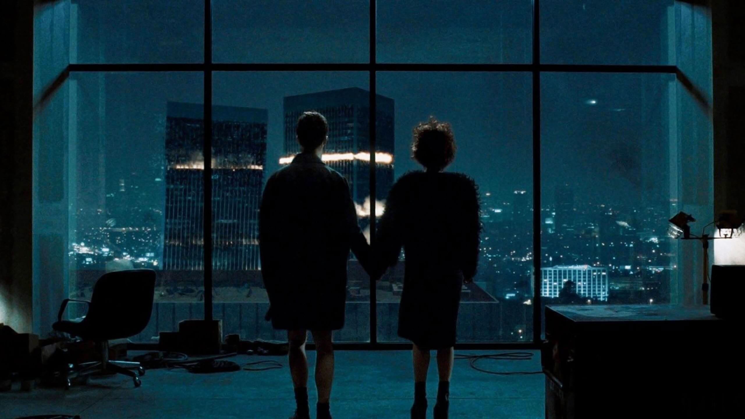
Photogrammetry and The Ikea Nest
I was fascinated by the visual effects used in the apartment explosion sequence because it was one of the earliest uses of photogrammetry in cinema. I noticed that the camera moves through the scene of destruction with a fluidity that physically impossible cameras could never achieve. The director froze the moment and mapped photographs onto 3D geometry to allow us to survey the debris of the Narrator's consumerist life. This plot analysis through technology reveals that his possessions were literally trapping him. The camera glides past the Ikea furniture labels which emphasizes that his identity was nothing more than a catalog of mass produced objects.
The Fincher Palette of Insomnia
A critical review of the color grading shows a deliberate avoidance of the color red until the very end. I observed that the entire film is drenched in a sickly fluorescent green and desaturated yellow. This visual aesthetics choice mimics the feeling of chronic insomnia and office lighting. It makes the world feel bruised and rotting. I found that this specific color temperature creates a psychological unease that makes the violent liberation of the underground fights feel visually distinct and strangely purifying by comparison.

The Flickle Visual Score
9.7/10 – I am awarding this high score for the revolutionary use of photogrammetry and the subversive editing techniques that weaponized the film format against the audience itself.
If you think you have the eye to spot every single frame of Tyler Durden then test your skills in our daily movie puzzle game at https://www.flickle.co

Mastered the Frame?
Test your visual memory and see if you can guess this movie in 6 frames.
Solve Today's Puzzle