Bridgerton: The Technicolor Dream of Regency London
I used to believe that period dramas required a muted color palette to feel authentic but Bridgerton completely shattered that assumption. While many critics focus on the romance I noticed that the show utilizes a radically modern visual language to tell a story set in 1813. My analysis suggests that the deliberate historical inaccuracies in the visual presentation are not errors but a sophisticated stylistic choice that prioritizes emotional truth over textbook realism.

Chromatic Coding and Family Status
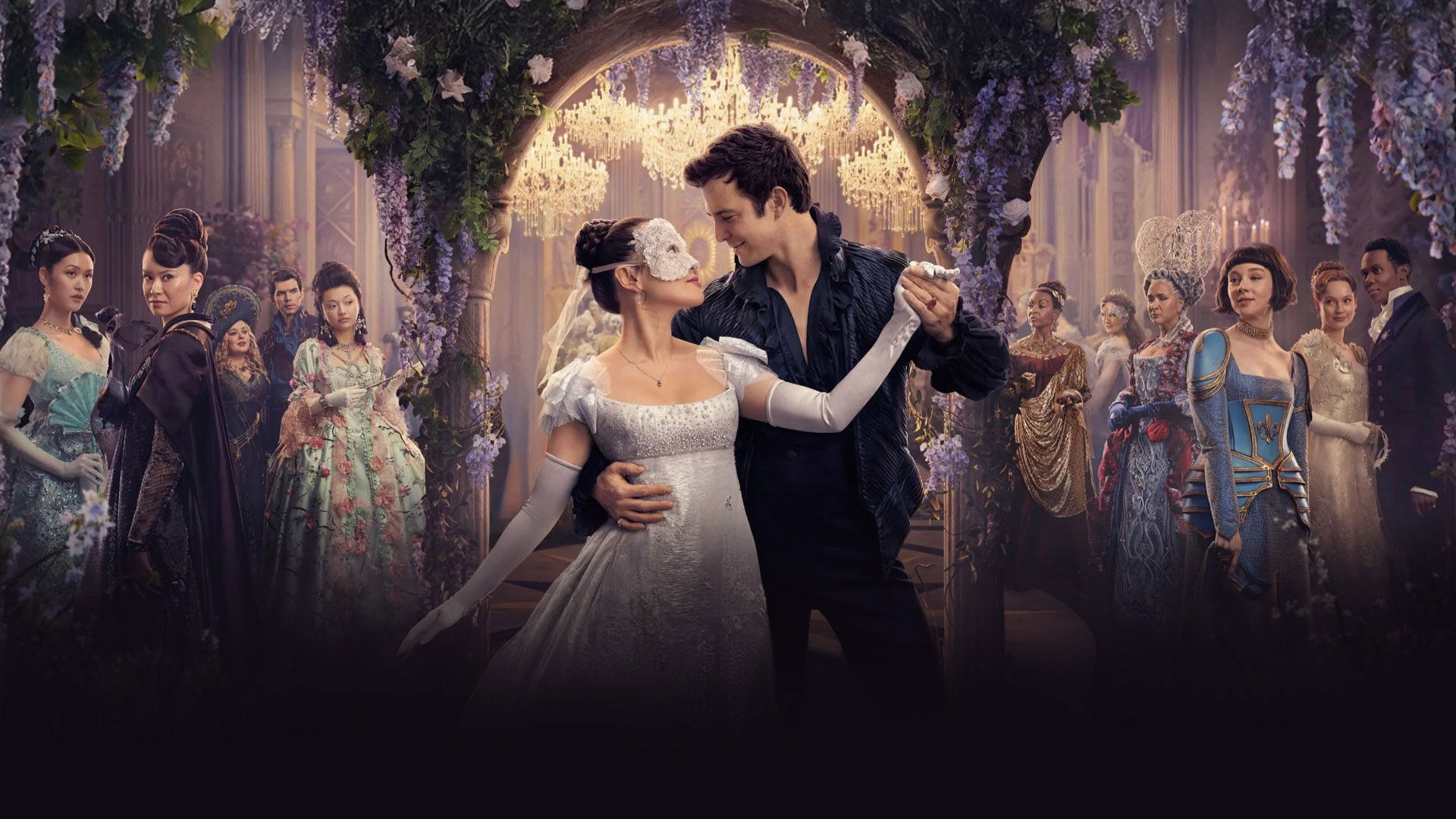
The most brilliant aspect of the production design is the strict color coding used to distinguish the rival families. I observed that the Bridgerton family is almost always dressed in powdery blues and muted lilacs which symbolizes their old money status and inherent elegance. In sharp contrast the Featherington family is draped in acidic citrus colors like bright yellow and lime green. This visual aesthetics choice immediately tells the viewer that they are "new money" and desperate for attention. This use of chromatic contrast allows the audience to understand the social dynamics of a crowded ballroom scene instantly without needing any dialogue to explain the hierarchy.
The Female Gaze and Soft Focus
A critical review of the camera work reveals that the show is filmed entirely through the "female gaze." I noticed that the cinematography treats the male leads with the same objectifying glamour usually reserved for women in cinema. The camera frequently lingers on forearms or hands or the unbuttoning of a shirt with a shallow depth of field. I found that the lighting is consistently high key and soft which creates a glowing and dreamlike quality around the romantic interests. This visual storytelling technique places the viewer directly inside the desires of the female protagonists and validates their perspective as the primary narrative lens.

The Kinetic Ballroom and Steadicam
I was impressed by the energy of the ball sequences where the camera becomes a participant in the dance. Instead of static wide shots I noticed that the director of photography uses swirling Steadicam movements that rotate around the couples. This creates a dizzying effect that mimics the feeling of falling in love. The plot analysis of these scenes shows that the dance floor is the only place where the characters can truly communicate. The movement of the camera matches the choreography perfectly which transforms a rigid social ritual into a fluid expression of emotional freedom.

The Flickle Visual Score
9.1/10 – I am awarding this score for the bold reinvention of the period genre aesthetic which utilizes saturated technicolor palettes and modern camera movements to make the 19th century feel urgent and contemporary.
If you think you have the eye to spot the difference between a love match and a social climb then test your skills in our daily tv show guessing game at https://www.flickle.co

Mastered the Frame?
Test your visual memory and see if you can guess this movie in 6 frames.
Solve Today's Puzzle


