Fallout: The Satire of Decay
I admit that I expected a disastrous video game adaptation given the track record of the genre but I was wrong to doubt the tactile commitment of this production. Fallout is not just fan service. I found that it is a scathing critique of corporate branding survivalism. My analysis suggests that the show succeeds because it treats the apocalypse not as a tragedy but as an absurd bureaucratic inconvenience where the end of the world is brought to you by a sponsor.

The Chromatic Dissonance
The production design creates a violent visual dichotomy between the subterranean vaults and the irradiated surface. I noticed that the vaults are bathed in artificial high key lighting that emphasizes the garish blue and yellow of the jumpsuits. This visual aesthetics choice creates a sense of forced cheerfulness that feels lobotomized and synthetic. I observed that this contrasts sharply with the surface world which is graded in desaturated brown and scorched earth tones. This chromatic separation forces the viewer to physically feel the loss of hope the moment Lucy steps out of the blast door into the blinding and hostile natural sun.

The Weight of the Armor
I was struck by the tangible weight of the T60 Power Armor. A critical review of the visual effects reveals a heavy reliance on practical suits rather than pure CGI models. I analyzed the movement of Maximus and noticed that the suit limits the range of motion of the actor which adds a necessary clumsiness to the action sequences. This visual storytelling technique grounds the sci fi technology in a rusty reality. I found that the sound design supports this by layering heavy hydraulic groans over every footstep which sells the immense mass of the machinery effectively preventing it from looking like a weightless cartoon.

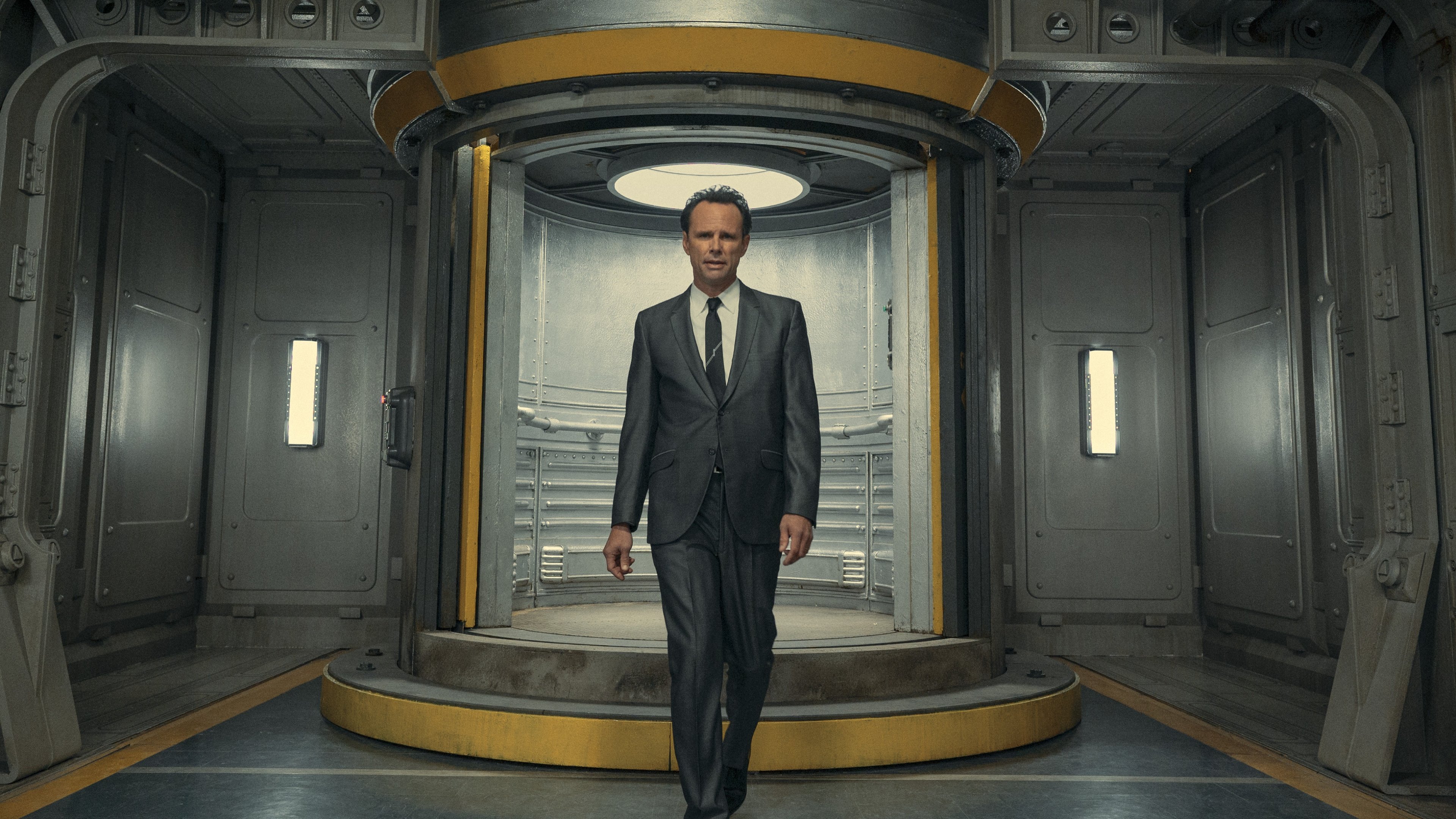
The Prosthetic Geography
The makeup design for The Ghoul serves as a bridge between the two eras of the show. I analyzed the prosthetics and realized that they preserve the micro expressions of Walton Goggins despite the heavy silicone application. The lighting frequently highlights the absence of his nose to create a skull like silhouette that evokes the classic western anti hero. I found that the camera often lingers on his eyes using extreme close ups. This technique isolates the only untouched human element in a decaying landscape to remind the audience that there is a soul trapped beneath the radiation burns.

The Flickle Visual Score
9.1/10 I am awarding this score for the seamless blend of on location shooting in Namibia with digital matte paintings and for the distinct color grading that honors the source material without looking like a parody.
If you think you have the eye to spot the Shady Sands library sign then test your skills in our daily tv show guessing game at https://www.flickle.co

Mastered the Frame?
Test your visual memory and see if you can guess this movie in 6 frames.
Solve Today's Puzzle


