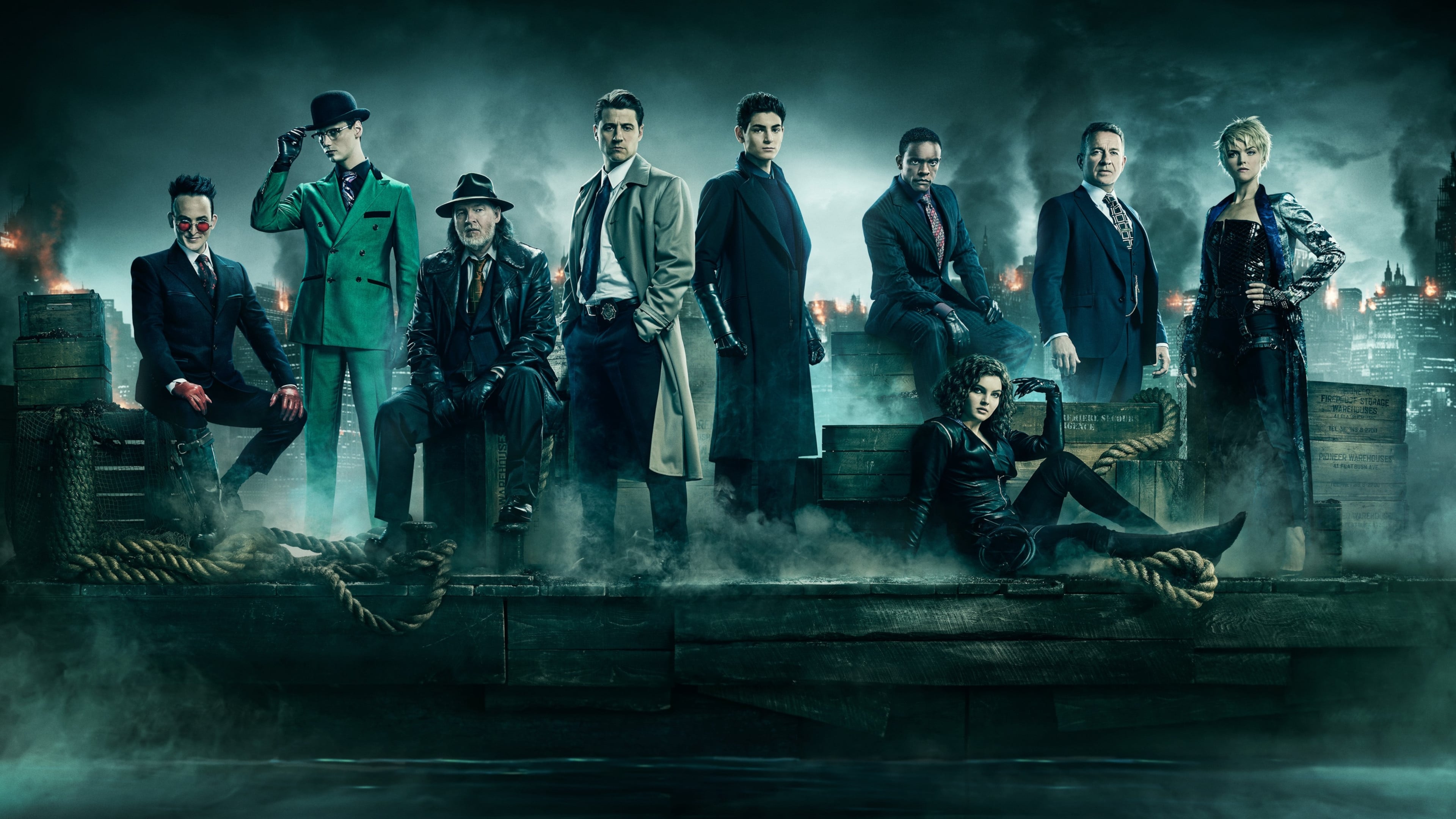
While many superhero procedurals lean into a generic "cop show" aesthetic, Gotham (2014–2019) carved out a unique visual identity that felt like a fever dream of noir and expressionism. Cinematographers Christopher Norr and David Stockton crafted a city that wasn’t just a setting, but a suffocating, living character.
The series is defined by its hyper-stylized lighting and deep, "inky" blacks. By utilizing wide-angle lenses and low-angle shots, the cinematography makes the architecture of Gotham feel looming and oppressive, echoing the rising tide of villainy. The color palette is equally intentional:
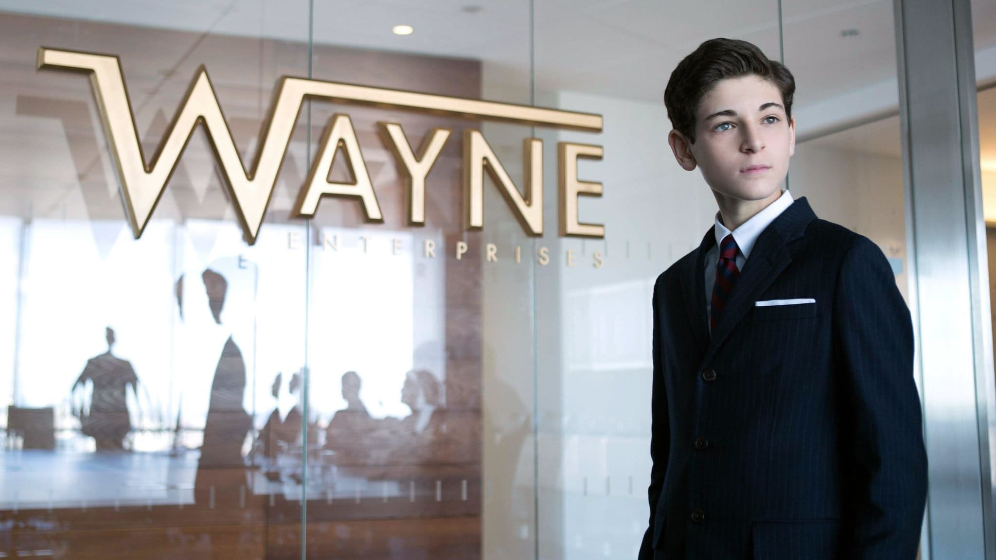
The GCPD: Bathed in sickly ambers and heavy shadows, suggesting a system struggling against decay.
The Underworld: Rich, saturated purples and emerald greens that give the villains a vibrant, comic-book pop against the grime.

The Streets: A permanent midnight, often glistening with rain to catch the high-contrast rim lighting.
What set Gotham apart was its "timeless" quality—mixing 1940s fedoras and rotary phones with modern technology. The camera work reflected this disorientation, blending classic cinematic frames with chaotic, handheld movements during the city's frequent descents into madness. It remains one of the most visually ambitious dramas to ever grace network television.

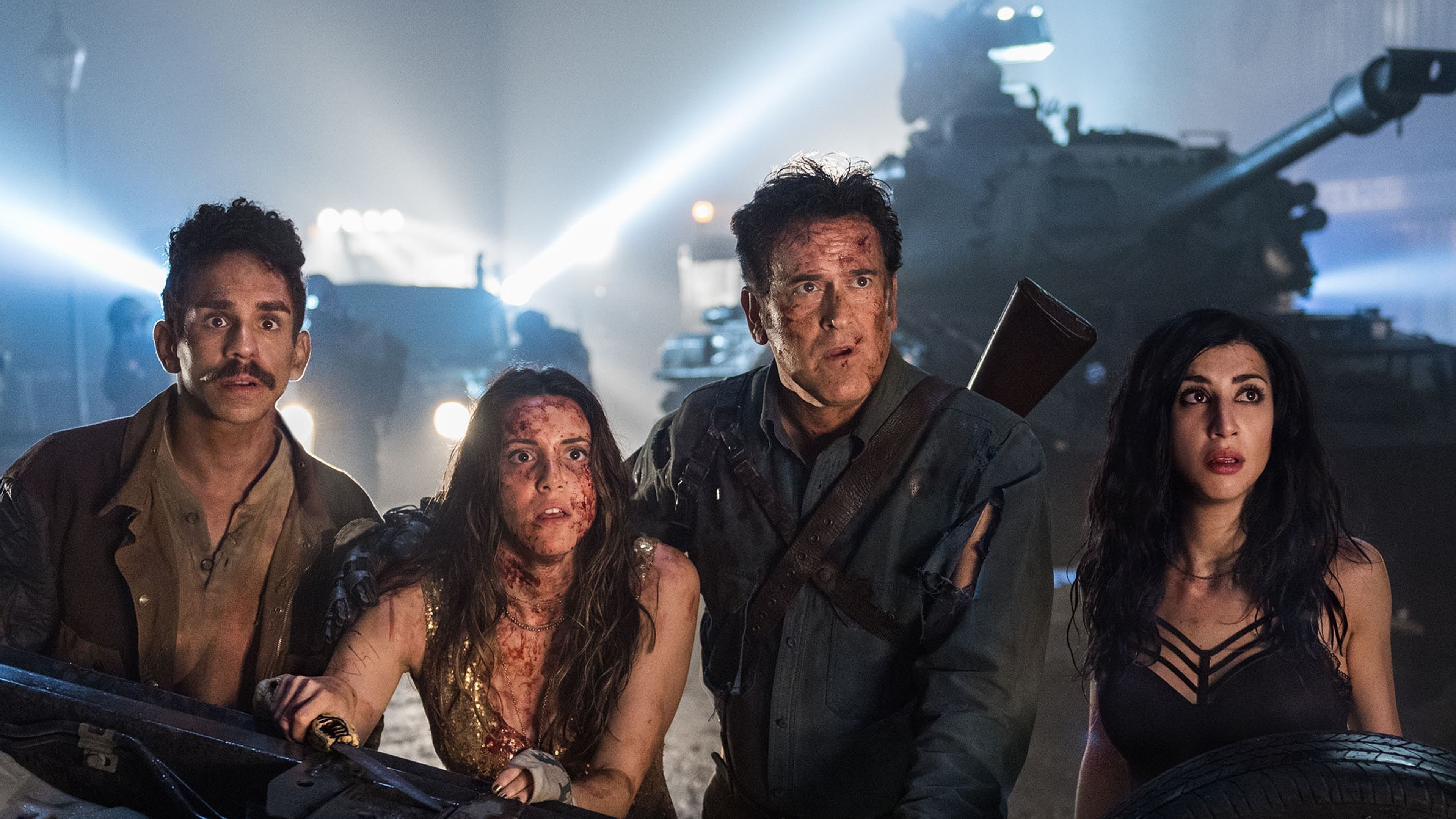


Mastered the Frame?
Test your visual memory and see if you can guess this movie in 6 frames.
Solve Today's Puzzle

