Star Trek Voyager: The Geometry of Survival
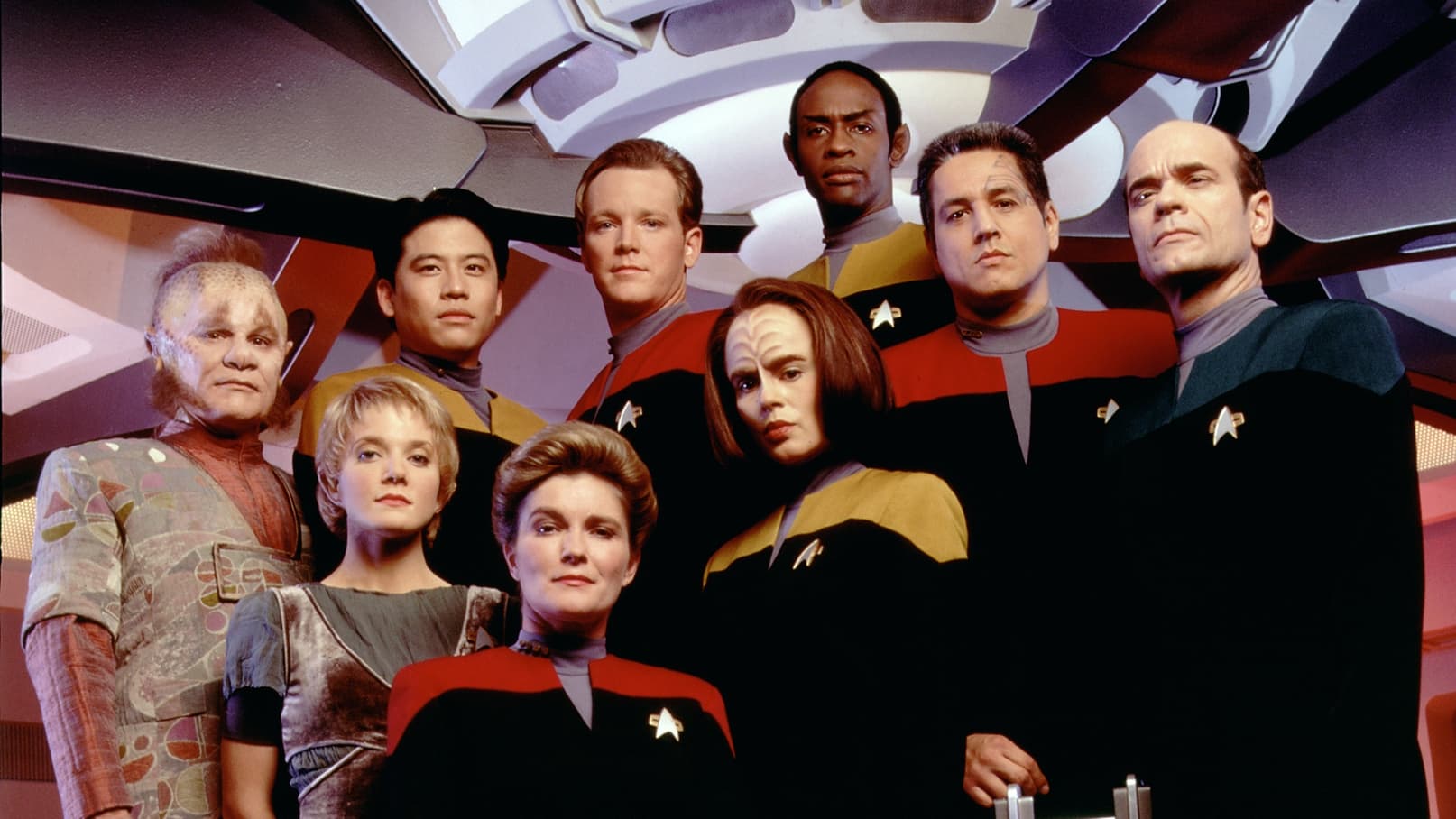
I admit that I initially dismissed Captain Janeway’s ship as a smaller and safer copy of the Enterprise but I was wrong to overlook its distinct visual identity. Star Trek Voyager is not a show about leisure exploration. I found that it is a procedural drama about resource management and maintenance. My analysis suggests that the show bridges the gap between the practical models of the past and the digital future of television. It captures the claustrophobia of a crew that is seventy years away from the nearest repair station.
The Intrepid Class Compactness
The production design by Richard James creates a bridge that feels significantly more cramped than the Galaxy class of The Next Generation. I noticed that the blocking forces the actors to stand closer together which creates an immediate sense of intimacy and tension. This visual storytelling choice reflects the narrative reality of a smaller crew that cannot escape each other. I observed that the lighting is cooler and utilizes more grey tones compared to the beige warmth of its predecessor. This aesthetic shift implies that the Voyager is a military vessel designed for efficiency rather than a luxury cruise liner for families.

The Transition to Digital Hulls
A critical review of the visual effects reveals that this series pioneered the franchise's transition from motion control miniatures to fully computer generated imagery or CGI. I analyzed the later seasons and noticed that the ship movements became more fluid and dynamic because the virtual camera was no longer bound by the physical limitations of a studio rig. This technological shift allowed for complex battle sequences like those in "Scorpion" where the camera could dive through the intricate structures of Borg Cubes without cutting. It marked the moment where television effects began to rival cinematic productions.

The Borg and The Green Gradient
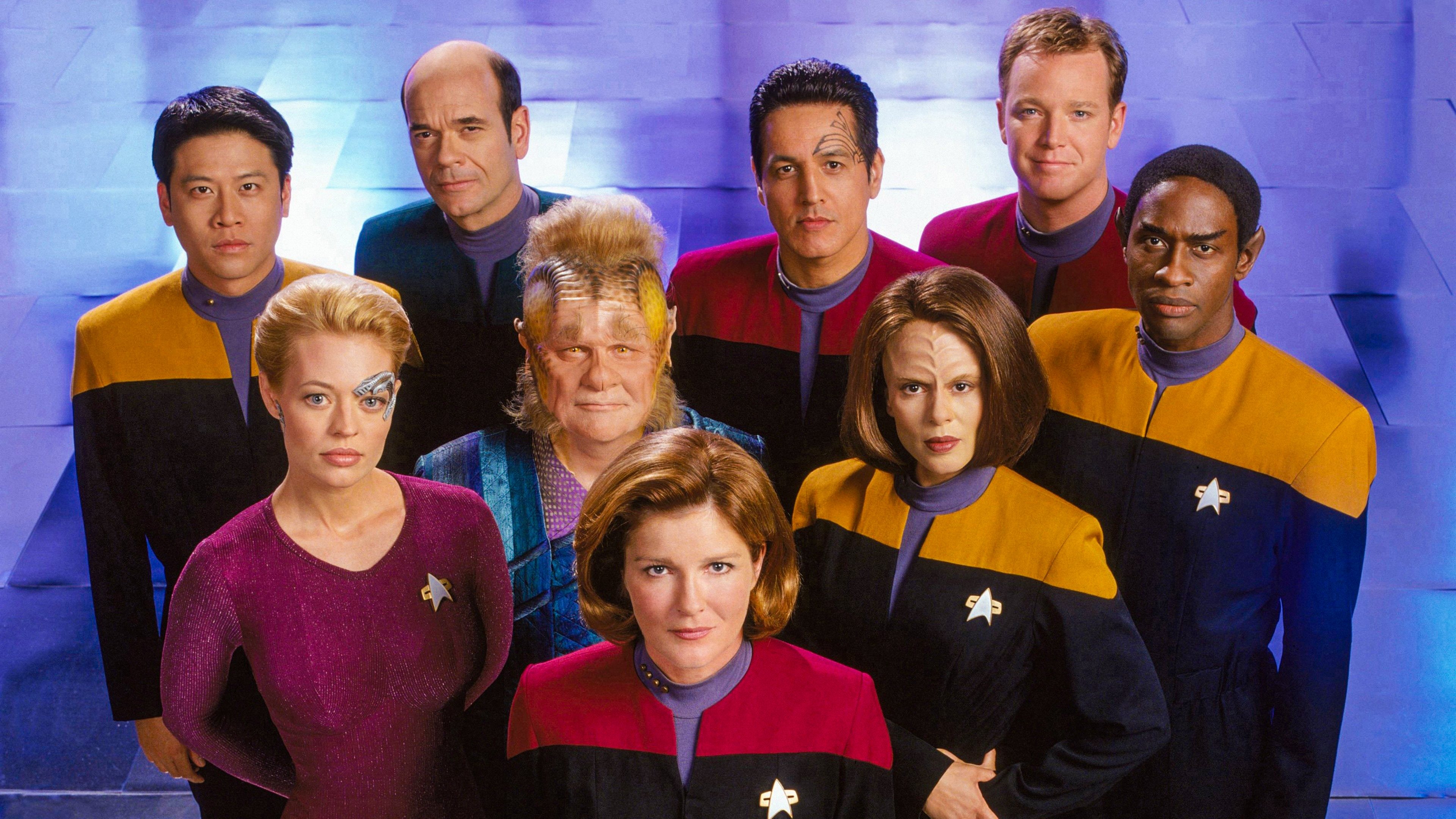
I was struck by how the show redefined the visual language of the Borg Collective. I analyzed the color grading in the Borg centric episodes and realized that the use of a pervasive sickly green filter creates a visual shorthand for infection and assimilation. The makeup design for Seven of Nine acts as a bridge between the two aesthetic worlds of the show. I found that the contrast between her pale organic skin and the metallic cybernetic implants creates a constant visual conflict. The camera often isolates these metallic components using a shallow depth of field to remind the audience of the threat she once posed.

The Flickle Visual Score
8.8/10 I am awarding this score for the ambitious transition to CGI starships which paved the way for modern space operas and for the distinct production design that made the ship feel like a character that evolved and took damage over seven years.
If you think you have the eye to spot the difference between a Type 6 Shuttle and the Delta Flyer then test your skills in our daily tv show guessing game at https://www.flickle.co

Mastered the Frame?
Test your visual memory and see if you can guess this movie in 6 frames.
Solve Today's Puzzle


